
Tellwell Publishing Review
- KyrieWang

- Mar 24, 2022
- 20 min read
Updated: May 16
Neither the assisted publishing company (Tellwell.ca) or the cover artist (Sheng Mei) sponsored me in reviewing their services. All opinions are my own.
Update April 2, 2024
I added the link for Reedsy's free typesetting tool for book interior formatting.
********
The original intent of this blog post was to chronicle how it took me months to resolve cover quality issues (the original post is still below). However, how this post has evolved!
I'm back updating because hundreds of people are reading my review of Tellwell here to decide if they should hire this overpriced company.
The answer is NO. Hard stop. As of today, they will charge you $1,799CAD for three things you can do for much cheaper ($35usd or less):
1) If you need a cover, Getcovers.com will make you one for $10-35 USD without AI technology. Their ebook, paperback, and hardcover files come ready to upload directly onto Amazon or IngramSparks, with all the bleed and spine measurements done for you.
Here are my two awesome covers from GetCovers.com. Click the images to enlarge.


2) If you need interior formatting for a book, try Reedsy's FREE typesetting tool, which will generate both a PDF (for printing paperback and hardcovers) and an .epub (for selling ebooks) from a .doc file.

I have not used this tool myself as I wanted to be fancier with my book, but I have heard good things about Reedsy's free tool from other authors.
Alternatively, buy Atticus, the one-time-cost software that lets you do the interior layout yourself with all the bells and whistles. I personally use Atticus. Here's a page of my debut novel, Healer's Blade (Enemy's Keeper Book 1), made with Atticus:

The best part of typesetting your book yourself is that you can fix typos in 15minutes and re-upload your book onto Amazon KDP as many times as you want, for free.
3) Finally, upload your final manuscript onto Amazon KDP or IngramSparks for free. Hit the "publish" button when you're ready, and your book will be published! Both companies offer tutorials on how to do it. It is not hard to enter keywords and categories, a blurb, and attach a file; you will need to do essentially the same for Tellwell's online system if you ever hire them.
Side note: Amazon KDP and Atticus Customer service when you need help
Amazon KDP has super fast customer service. You can choose to chat with a representative and get served within 10 minutes. I've chatted or requested a call multiple times regarding manuscipt uploading questions, why my book was only best-seller in one category but not this other one, and other random questions. Each time my question was answered.
Atticus, the interior formatting software, has also resolved my problems within 1-2 days by email.
Do not fall for Tellwell's claim that publishing is so daunting that you need their invaluable guidance. The other companies are also able to help, and they will not suck up thousands of dollars. There are also many, many free Youtube videos that you can watch other than their orientation videos. Atticus, the interior formatting software, has also resolved my problems within 1-2 days by email.
By uploading your manuscript to KDP and IngramSparks yourself, you will have control over your dashboard for keywords, categories, price changes, cover changes etc...
And have your book distributed to 40,000 retailers & libraries (I quote IngramSparks below)

Compare the costs of the three above to Tellwell's lowest-cost package, which will do the same thing but costs 1,799$ CAD (as of today).

Now, Tellwell will give you the choice between direct distribution (in which you upload your pdf and ebook files yourself for free on KDP and IngramSparks).
OR
Their managed distribution plan, in which they will take 15% of your royalties unless you pay $500 to keep 100% of your royalties.
Screenshot here to prove myself. Tellwell may change this later, but as of today, it's a terrible deal. Source of the screenshot:

In my orientation sessions and phone calls with my project manager, the benefits of managed distribution were touted over and over again. There was NO discussion that you will not be schedule price changes to organize book sales with managed distribution (if they do it for you, the change can take weeks).
Ex: You want to tell your newsletter subscribers your book will be 99cents from March 1 to March 5.
Well, you can't run this 5 day sale...
Because you can't guarantee your book can be on sale March 1 to March 5 if Tellwell controls your metadata (i.e. prices, keywords, categories, etc)
Two ways Tellwell's Managed Distribution sabotaged my chances of ever running a proper book sale:
1) Tellwell takes days to weeks to change prices. Luck of the draw. You need to email them and hope for the best.
2) I couldn't schedule my book sales ahead of time
As a new author, you need to run sales to have your books noticed by the world. I sold NOTHING outside my family and friends until I unpublished my book and republished it, and ran proper sales with precise start and end dates. Then the royalties kicked in from people I didn't know, lol.
In addition, when I was with Tellwell, they allowed only one metadata change PER YEAR. That means you can discount your book to 99cents, but it's stuck as such for the year. I argued against this ridiculous policy and was allowed >1 metadata change per year.
I was still unable to run a sale because I couldn't schedule anything ahead of time.
Now, why didn't anyone tell me I'd run into this serious marketing problem when I had to decide between Direct and Managed Distribution?
(Maybe because they want 15% of your royalties under Managed Distribution, or make you pay 500$ to keep 100% of your royalities? Maybe.)
There are many other problems with only 1 metadata change per year, such as when
1) You want to update your blurb because you realize your initial attempt wasn't that catchy. I changed my blurb probably 20x since publication.
2) You win book awards and want to update your Amazon listing with each win
3) You want to change your book's categories because Amazon has come up with new categories that are just right for your book.
What if you updated your blurb once already? Now you can't announce your big book award win, or change your category, because you used up your one change.
Let's say you regret your decision to choose Managed Distribution.
The switch to direct distribution, means you manage your distribution accounts like KDP, costs 250$ (I cite their helpdesk).
Or you know, you can upload your book on Amazon KDP or IngramSparks for free and distribute it to "40,000 retailers and libraries" (see IngramSparks screenshot above)
You say: But I need help with my Amazon Tax Interview! And Tellwell will take care of that under Managed Distribution.
Yes they do, but in their orientation sessions, they overstress how much "work" it is. As a Canadian, I asked my Canadian accounts about the Interview, and they referred me to specialized Canadian-USA accountants. These accountants did a Zoom session with me in which I shared my screen of my Amazon Tax Interview, and in 20mins they helped me fill it out together.
And it was over!
You will have to pay your accountants, but I strongly suggest you pay them rather than throw money at Tellwell for "Managed Distribution" and get stuck in a marketing nightmare.
But given the costs of Tellwell, the services must be of good quality?
No.
I had cover color issues, then blurry cover issues for months, which I talk about in the original blog post, below. Now that I have hired GetCovers.com (for a 35$ USD cover) twice for amazing covers, I know it is possible to get everything right 100% the first time. Tellwell has no excuse for the cover color being too dark, or the cover being too blurry.
Two other authors have contacted me since 2022 to commiserate about the poor interior layout of their books (one non-fiction, one a cookbook) and the inability to get hundreds of dollars back. (I'll be back to update if I get more authors)
Here's Margot Freitag, author of Plant Powered Punks. Screenshot shared here with her permission:

My Reddit post about Tellwell is here: https://www.reddit.com/r/selfpublish/comments/c0bnc0/comment/i20u551/?utm_source=share&utm_medium=web2x&context=3
There's no getting back the 10k dollars I spent only to receive a suboptimal cover print quality and ineffective marketing strategies. I sold nothing outside my friends/acquaintances circle, and even then, Tellwell kept 15% of the royalties because I was under their Managed Distribution program.
Their team was very "nice", but I wouldn't pay thousands of dollars for empty pampering.
There is a certain population Tellwell services may be good for--
those who want to publish only for family and friends
who don't want to make money selling their books
who have lots of money to spend
who have no time or energy to learn how to publish...
but can wait for months while their cover printing issues or other problems get resolved In which case, go for Tellwell.
I unpublished the book I had published with Tellwell, Forbidden Ties. Then I released it, completely rewritten and expanded, as Healer's Blade (Enemy's Keeper Book 1). The difference between the two releases couldn't have been more different. The book published under Tellwell had nearly no sales in 3 months and had nearly no reviews, because my Tellwell project manager published my book without my permission and before my review team was ready.
The book I published myself had zero cover quality issues, and here are my stats

Note: I did NOT run a free book promo and count a free book "sold" as a sale.
For people daunted by the prospect of marketing, know that Tellwell may claim to guide you and hold your hand, but their marketing package (which included blog tours, IndieReader Review, BookFunnel giveaway, book backgrounder, and newsletter share) resulted in no sales. There was no guidance on writing front matter or back matter, including a call-to-action to sign up for your mailing list, setting up a reader magnet on your website, promo stacking, etc. I had to organize my own review team to get book reviews, and even that attempt was botched when my project manager released my book before I was ready.
If this sounds like total jargon, here's a free course on marketing that I followed in launching my book the second time:
Healer's Blade (my re-release) still makes consistent sales via copies sold and KU pages read every week even ten months after launch, and I just released my second book, The Thief's Keeper (An Enemy's Keeper Prequel). I'm so grateful to have learned from my mistakes.
Do not fall for Tellwell's claim that publishing is so daunting that you need their invaluable guidance. The other companies (KDP, Atticus, GetCovers) are also able to help, and they will not suck up thousands of dollars (Note: I have no experience yet with contacting Ingramsparks. Their system just works). There are also many, many free Youtube videos that you can watch other than their orientation videos.
Update July 11, 2022
I contacted the Tellwell quality assurance personnel shortly after my last post in June, complaining that the post-publication cover update process has been extremely slow. Within a week, I got a draft of my new cover (fitting in the freelancer's cover image, the back cover, the spine, etc) to approve.
I checked yesterday and the new cover is finally uploaded on Amazon. From my initial request for post-publication cover modifications to a new cover being uploaded onto online retailers, it took about 3 months... and that's because I hired my own freelancer to update the illustration. Can't say I was thrilled with Tellwell in this process.

Update June 10, 2022
I am officially disappointed with Tellwell. While the cover design process was a breeze, mostly thanks to how quickly my freelancer artist Sheng Mei finished my drafts, Tellwell has yet to iron out my cover distribution and printing problems. Specifically, the online listing on Amazon is a low resolution image* and the printed cover art details are grainy.
It has been about 2.5 months since my original complaints and nothing has been fixed.
*Granted, it may be Amazon's fault for compressing my image size. But then why do other Amazon book covers not have this same low-resolution, faded-out problem?
Here's my book's cover on Amazon.ca. It's faded out and you can hardly make out Toby's features. Just scroll down to see what the original artwork looked like.

2.5months months ago, my project manager agreed to revert the cover art back to whatever Sheng Mei did (original colors, quality of resolution, etc)
Since then, only updates that my cover is still on the queue to be modified...
I contacted Sheng Mei directly, out of my own volition, and she updated my cover in 2 days. But it's not on any online retailers yet because again, Tellwell needs to evaluate the colors of the cover and update my book listing online.
Meanwhile, it's been months since my book is out in the world with a less-than-ideal cover. And we all know readers do judge a book by its cover. I will be working with Sheng Mei directly from now on and publishing the next books in the series without Tellwell.
Update May 23, 2022
I didn't forget to update this blog... it's just that my printed cover problems are still on the Tellwell queue and have still not been fixed. It's been about two months since my original complaint of its blurriness (see below for complete details).
To be continued again.

The moment when I received my cover art draft was when I felt like my publishing project was "real". I hired Tellwell.ca to help me with my publishing journey and was fortunate enough to find a very talented artist, Sheng Mei, to do my cover from their list of illustrators.
Of note, this is not a post talking about Tellwell or Sheng Mei's packages or fees. You are welcome to check out their websites (just click on their names above) for details.
It didn't start out the way I expected
Honestly, the very beginning of my cover design journey is now a fuzzy memory. But I do remember feeling anxious when my original cover designers (and there were 2 of them!) video called me and said, essentially, that they couldn't satisfy me because I had a very specific cover in mind.
Although one of the two designers was also an illustrator, her drawing style was not suitable for the genre of my book (young adult, not children's).
They recommended that I select one of Tellwell's illustrators to do a custom illustration instead. Because I had a premium cover design package with Tellwell (it came free with a promotion), the illustration came at no extra cost. Well then... what are we waiting for?
The illustration questionnaire
Then came the very long illustration questionnaire of exactly what I wanted.
Click here to see what I wrote (haha, a whole essay)
* Author Name Kyrie Wang
* Book Title Forbidden Ties (Book 1 of the Enemy's Keeper series)
* Who is your first choice for illustrator? Sheng Mei
* Who is your second choice for illustrator? Stefanie
* Who is your third choice for illustrator? Maddy
* Please provide one reference illustration that matches the style of illustration you envision as closely as possible. Li_ShengMei_Empress.jpg (https://api.typeform.com/responses/files/7baf6e97b99b02f5c009e0d88c338b1722f3b795b31e6b4be30574d7234b6d90/Li_ShengMei_Empress.jpg)
* What is it about your preferred illustrators and their illustration style that you like? Sheng Mei draws with a high degree of realism and yet enough "fantastical" elements to fit with the coming of age themes of my novel- similar to Final Fantasy video game series. I have always imagined my characters looking like those from the Final Fantasy video game series (FF10 and later). She also is a cover designer according to my project manager, and I am looking for a illustrated cover. I like Stef and Madeleine's styles for the same reason.
* What Trim Size have you chosen for your book? Other (please contact PM to confirm)
* What is your target market or age range for your book? 13-25, female predominance
* Please describe, in detail, the main character of your book. For a human character, this could include hair colour and length, skin colour, approximate age, important facial features, clothing items, gender, body type, etc . For a character that is not human, be as specific as possible so that the illustrator can visualize what you see your character looking like. The story is set in 11th century England and clothing is historically accurate. The main character to be on the cover is Toby, male, 20years old. He is thin, about 5ft 10, and has blond hair with a sackcloth cap partially covering his hair (except his bangs, which are long like most final fantasy characters). He has just the beginnings of a stubbly beard (1mm in length). He wears a grey padded long sleeve tunic (called a gambeson, please google for images) with a belt and sword hanging from his left side. He also has a cape of any darker color you think is best. For lower body, people back then wore cross-gartered breeches and leather shoes. For example please see https://www.pinterest.fr/pin/815151601286696775/. Breeches and shoe color is a dark color of your choosing.
* How many illustrations will be completed? 1
* Illustration 1
** Please describe the main character of the scene. What action is he/she doing? What is he/she wearing? The book cover shows Toby from behind riding a running horse and carrying a young woman (unconscious) before him against his chest. The "camera" is angled to quarter view so his face can still be seen from behind. He is sweaty and his face is bruised with scrapes and cuts. He is looking worriedly into the distance as he rides through pine forest with a colorful sunset. Dead leaves are flying from the ground and there is wind effect on his hair and clothes. He is wearing what I described previously.
** Please describe the scene. Are there any other characters in the scene? What do they look like? What are they wearing? What are they doing? What objects are in the scene? What is the setting? If outdoors, what time of year is it? The young woman Toby is carrying is my other main character. Her name is Heather and she is 17. (I sent my drawing of her to my cover designers and I hope you can access it ). SHe has shoulder-length, straight light brown hair and pale blue eyes. Heather's clothes: long sleeve tunic (beige or brown, something dull), belt with pouches, and small dagger. Drab trousers similar to Toby's. Patches in clothing preferred. She's very thin. In the scene I imagine, you see Toby from the left side. His sword is obviously hanging from his belt but only Heather's back and shoulder-length hair can be seen as Toby carries her on horseback. If you can fit in a bit of her face with eyes closed and long, pale eyelashes that would be great. There is a third person in the scene- a child of 9 years old with unruly black curly hair past her shoulders. Her name is Emma and Toby has become her caretaker since she's orphaned. She is wearing clothes similar to Heather (peasant clothes from the 11th century) She is running to the left of Toby on the other side of the illustration alongside his horse and only her back can be seen. ALthough if you think it is better (as a cover designer) that she look to Toby with a excited, big grin, you can draw that. She thinks Toby has brought her a friend, but Heather is actually the sister of a man who betrayed Toby, and he still isn't sure what he will do with her.
The horse riders and child are running towards an abandoned sandy beach with a glistening river in the distance. Mountains can be in the background. It may be difficult to fit all that in so I'll leave it to your discretion how much of the "destination" can be drawn. Although, I think as cover it would be more interesting to see the sky/sunset/beach/river they are speeding towards. The beach Toby is riding towards can be either downhill or uphill, or downhill then uphill, as you see fit, to make the cover attractive and the camera angle enticing. Toby is not riding alone; 4-5 other riders wearing the same stuff as him are riding behind and before him. Optional to fit them in as dark shadows.
** If you want something specific to be the focus of the illustration, provide a detailed description. For example, "Man's emotion and facial expression is contemplative and a bit sad." Or, "The dog is wagging her tail with joy and excitement because her owner loves her." Toby's anxious expression is important. He is very conflicted about the young woman he had just saved, as they are supposedly enemies (hence the title of the book)
** Please include any requests for colour. If there are characters or objects that you don’t provide colour requests for, the illustrator will choose colours. Please be as specific as possible. For example, burnt orange may be better than orange in some circumstances. I would like a colorful sunset +/- clouds as you see fit. The clothing of my characters are dull because of their social status (or who they are pretending to be), as described earlier
** You can choose to attach a reference image to clarify a specific aspect of the illustration, if appropriate. For example, if you have a specific type of vintage truck in mind for the illustration, attach a photo. Horse_quarter_view.jpg (https://api.typeform.com/responses/files/748f37031ebad4b44f93573e71e00d85b81d02ae81a9f9c22fca4d39ef45a8a4/Horse_quarter_view.jpg)
** Any explanation of the reference image you attached can be written here. I attacehd by what I meant by "horse quarter view from behind". The man's face can be even better seen if he turns a bit, and I hope Toby's anxiety can be captured.
* Which illustration number is the front cover illustration? 1
* Which illustration number is the back cover illustration? I think you are only drawing the front cover
After writing all that, I could see why cover design using stock photos would never have accomplished what I had in mind.
I didn't know what to expect, given that I had asked the illustrator for a lot of historically accurate detail (cross-gartered breeches and gambesons, anyone?). Also, I could describe the scene well enough, but for it to be an exciting cover?
And certainly, I took a risk, now that I look back. If I had chosen a boring/unrepresentative scene from my novel to display as my cover, that would've tanked the whole publishing project. I essentially bypassed cover design expertise by saying, THIS IS WHAT I WANT!
So, I don't necessarily recommend that you tell an illustrator what to draw for your cover... most self-publishing advice websites I have since browsed recommend that you don't design the cover yourself. In my case, I sort of did.
The fun begins
Tellwell told me that because some artists are busy, a draft could take weeks to arrive. So imagine my delight when the draft came two days later.
And of course, it wasn't perfect. But it blew my expectations out of the water. Like, I couldn't even imagine such a cool camera angle because I don't run behind horses all day? And she did this in just two days? Here was the full first draft (click to enlarge)

But the rider's face was not... impressing me.

Neither did the mountains in the back make sense with my novel when I thought about it.
Heather's (lady on the horse) hair was also too long, etc...
(To read all my revision demands as a very demanding customer, click here)
Overall impression: Excellent!! I love it!! The perspective is enticing, the medieval clothing is right on and I so is Toby’s hair!
What needs to change:
CHARACTERS:
Toby:
I changed Toby’s face. Please see attached image (edited by author.jpg). The original face was just not what I want… The new face has features that need to be blended better-shading, coloring etc. I’m sure she can do that. As a reminder, Toby has blonde eyebrows and hazel eyes.
I also included the face itself as separate file. Maybe she can make a layer out of it and use it as a new face (face remake only.jpg).
Cloud Strife was used as the model for Toby’s face (see https://store.eu.square-enix-games.com/en_GB/product/435605/final-fantasy-vii-remake-play-arts-kai-no1-cloud-strife)
As I mentioned before, final fantasy games FF10 and later (or FF7 remake) are the standard models I use for my characters.
Toby’ head seems really small to me even with the angled perspective. I have made it bigger in my revision and maybe it can be even slightly bigger.
Heather:
I reread my novel and there were details I forgot to mention.
Her torso, including her arms, are wrapped in a blanket (whatever dark color you want). So when she first woke up, she couldn’t move her arms easily.
Heather has a greyish bandage around her forehead/head because she has a cut on her scalp. You can add a hint of blood on the bandage.
Please make her hair shorter. It should be just brushing the top of her shoulders when she is standing up straight.
Emma:
1) Emma’s hair needs to be curly black. Right now it’s wavy.
2) Emma’s arms look a bit odd. They are too skinny? I would love to have them thicker and more realistic, thank you.
SCENERY:
I have further refined my thoughts on the scenery Toby is speeding towards, which is more prominent in the draft than I expected (but in a good way)
The “mountains” of England look more like hills and I was thinking something more like the photos I attached. She can get inspiration from the photo but no need to be exact.
The pebbly beach and river are now optional.
Since it is medieval times, there will be more trees than in the photos. Toby’s procession would have wanted to be hidden in as many trees as possible.
Please include a small “mott and bailey” castle on a mountain top. Image attached. From the distance, probably only the fence and the elevated castle itself will be visible. For many more images, she can reference this link: https://www.castlesandmanorhouses.com/types_03_motte.htm. The “fence” and towers around the castle should be made of wooden logs, while the building itself is grey stone brick.
Another question:
Such a shame that the left side of the image has to go (the bleed margin). There is no way to keep that for a promotional poster? I understand if the right side of the photo should go (horses are hard to draw well)
Thanks,
Kyrie
Did you all catch I wanted my rider to look like Cloud Strife from Final Fantasy 7? :)
Thankfully, I had 2 revision rounds to take care of these issues.
Revision rounds...
This was where my perfectionist self, which I am usually able to turn off, was allowed to go full throttle. I didn't want to end up 2 revision rounds later with a face I was still unhappy with, so I used a tablet, taught myself some computer art principles, and drew my own face with the free app, Krita. I still don't know how to use 99% of that fancy drawing app, but I could do... a line drawing of a face. And it took me two hours 'cause my hand kept touching the screen, and I couldn't turn around my stylus and just erase my mistakes .... (paper and pencil, I love you).
This is why I really needed to hire Sheng Mei.

I pasted my own face into her drawing and did some erasing and coloring to make sure the face made sense.
Then I sent her my "face" as a new layer and asked her to paste it in properly.
"Hey, we want some new face!" - Psy

Revision round 2
Sheng Mei diligently implemented all my revision demands. Toby's face was flawlessly integrated and Emma (the nine-year-old girl running alongside the horse) had grown curly hair, hurrah!

Fast forward
I ended up paying for one or two extra rounds of revision because I wanted more trees in the background and also to fix Heather's hair, which didn't make aerodynamic sense to me. In the final, you will see that I made her hair stay against her neck.
Isn't this dreamy (I added the watermark):

Turning art into a cover
But we were not done yet.
I needed to add my book title and author's name. This came much later in the publishing journey, like 6 months later, while I was completing my 2 rounds of substantive editing.
Adding text was more straightforward. By this time I had excited friends who were following my project, so I showed them the images and asked for feedback. I highly recommend that you get feedback for your own cover, preferably from your book`s target audience; it's also a great way to generate hype for your novel.
Also, of course, look up other books` covers for inspiration.

(sticky notes above were my revision edits to the designer)

Color Woes
I realized, after two cover design revision rounds and the cover being "finished", that the cover image seems to be darker than Sheng Mei's original work. Too dark. If you see the "original cover" above compared to my final, the background art is much lighter because I insisted the designer go back and fix those colors!
This was essentially revision round 3, but Tellwell didn't make me pay extra.
Results of revision round 3: Tellwell made the image lighter, but the sunset had become desaturated and again I was not happy, and I told them so...
My project manager, Jun Mark, was very patient. He got back to me with these sample covers to clarify things, along with this message:
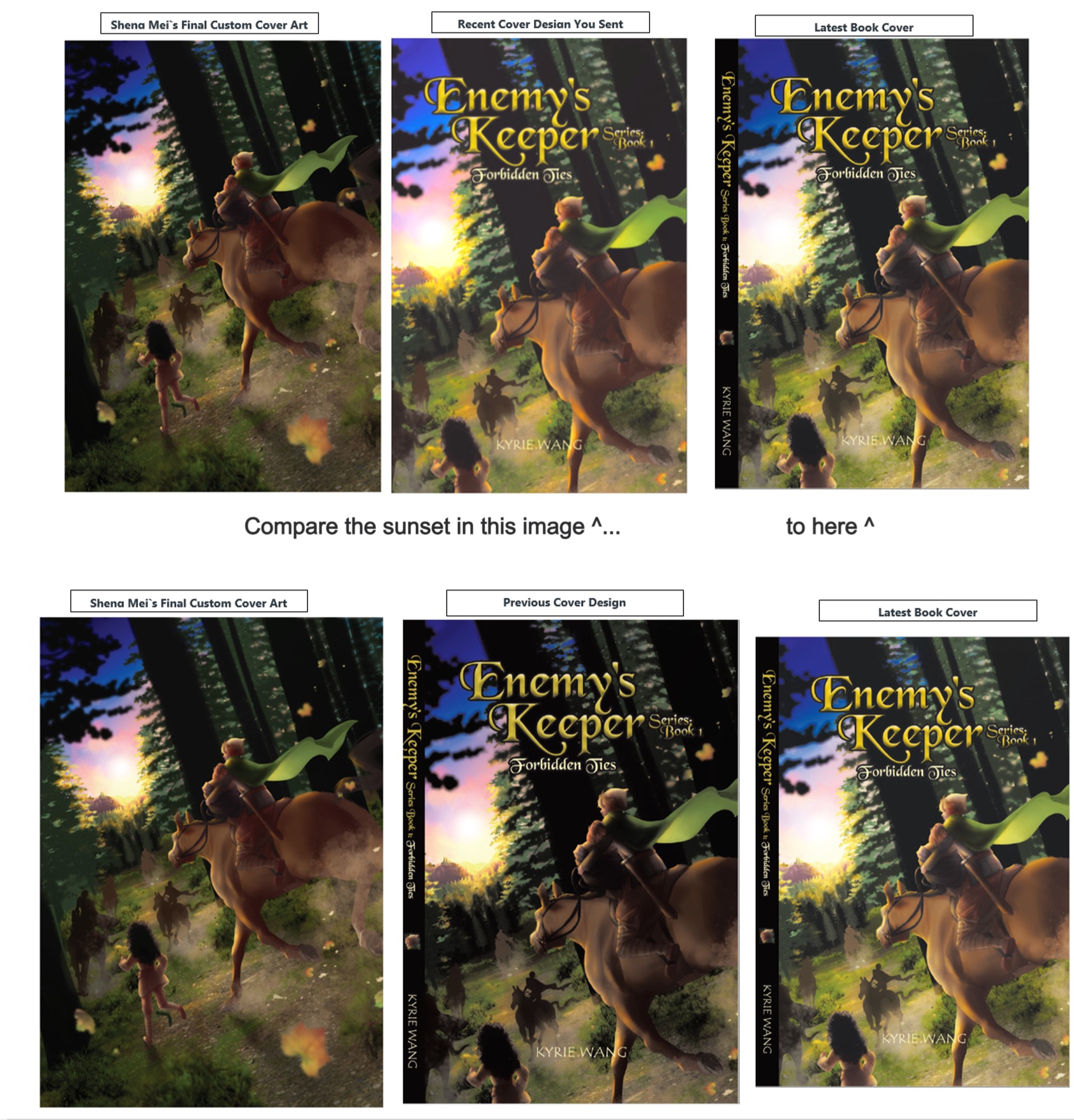
"...I would like to set a proper expectation that the majority of your book orders (through Tellwell or Retailers) will be printed through IngramSpark, which is one of the largest and most reputable companies in the print-on-demand industry. The quality is generally considered to be in the "Goldilocks zone", where the quality is more than satisfactory for the vast majority of consumers. This is why Tellwell and just about all other assisted self-publishers use these two companies for print-on-demand fulfillment of our authors' books.
With print on demand, slight variances are normal. There will be a slight variance between what you see on the screen and what you see in print. There will also be a variance between print run to print run—meaning, a copy from one batch by the same printer, may have a slight variance from a copy from another batch even of the same printer. At times, it can be slightly lighter; at times slightly darker. However, Tellwell and IngramSpark make sure that these variances are maintained within a certain degree that we deem to be within our printing standards"
We agreed after this that Tellwell would "re-saturate" the sunset, and leave the rest as is. I was very happy I didn't have to pay extra for these color corrections!
The Printed Book
The printed product came yesterday in the mail. Unfortunately, the details of the rider's face were grainy and the color was not as great as on screen. Although I don't think this is within Tellwell's control anymore, I will let them know and report back here if I hear anything.
Ik ben tevreden met de gestructureerde benadering die hier wordt toegepast. De discussie over interactieve digitale diensten lijkt echter de mogelijke risico's te overschatten. Op de website is aanvullende informatie over dit booms bet nl onderwerp beschikbaar. Een kritischere aanpak zou de diepgang van het artikel verbeteren.
The cover-making tutorials and the additional advice on storing them for kdp amazon publishing were both enjoyable to me. It's brilliant and will save a ton of time to make covers in groups.